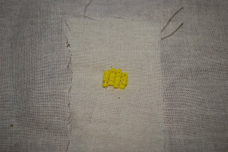
any guesses on what this chandelier by Joana Vasconcelos is made out of? Heres a clue...it starts with a "t" and it rhymes with "lampons."
Thursday, October 23, 2008
an exhibit we should see
here is an exhibit i found on wearable art that I thought could be cool for us to check out. it is in jersey city...is that close??
http://www.zwire.com/site/news.cfm?newsid=19314791&BRD=1291&PAG=461&dept_id=523592&rfi=6
my experience at MAD
I was pleasantly surprised with my experience at MAD. I was initially expecting it to be something like MOMA but it was much more "crafty" which I really liked. The first exhibition I viewed there was the second lives exhibition. More than anything, I was impressed by the innovative use of materials. It felt really inspiring and relevant to me because it encouraged me to think outside the box and has helped me with our current in-class design project. One of my favorite pieces from this exhibit was the metal jacket made out of dog tags. It seemed kind of ironic to me because the piece itself looked very "warrior-like" and dog tags themselves are representational of something warrior-ish. Another piece I very much enjoyed (for obvious reasons if yoiu know me well) was the chair made of shoes. Although it was impractical, I still found it to be a lovely piece and, yet again, an innovative way of using materials. If I could take one thing home with me, it would probably one of the chandeliers made out of recycled materials. It reminded me of the crain project that 2 fellow students in class were working on. Lighting is all around us yet we often do nothing decorative with it...This exhibit encouraged me to go home and paper mache my fixture! (Hey, its a start!)
Lastly, I was, if nothing else, quite amused by the wedding dress made of gloves. Although its totally impractical, it was nonetheless beautiful. It reminded me of a wedding dress I had once seen at another museum that was made out of feminine products (perhaps by the same artist??)
Wednesday, October 22, 2008
HELP!
Hey guys,
Rudya and I are having some difficulty coming up with proposals. On Tuesday, Denise mentioned that the concept of a pinata is really interesting and fits well with our code. Now, we can't get that out of our heads. WE'RE STUCK! We've also been thinking about different game ideas, but we don't necessarily want to design a traditional board game or puzzle.
If you guys can help us out with some ADVICE about what we should be thinking about or how we should be approaching this, PLEASE let us know.
Here's our instructional code:
1. Communication: learn the language: rules, vocab, symbols, signs
2. Dress: show/flaunt support: through dress, colors, and accessories
3. Socialize: Gather with people of similar interests
4. customs: Add traditions and rituals
5. Gaming: Add competition and obsession
6. Celebration: Celebrate by singing, socializing, eating, drinking, cheering, attending parades, etc.
THANKS!
Tuesday, October 21, 2008
our new proposal
what do you guys think?
we are not going to be in class on friday to present our refined proposal of our project.
we have chosen to do a large quilted container system. the quilt is designed to blend into peoples daily need within their homes. The purpose of having it be a quilt is that i can be placed in several places and things in the house look more beautiful.
The different compartments will be made out of the triangular shapes traditional quilts are made of. The size and placement of the opening will be different thought the pouches as well as the design of the foldable inserts
My journey to the M.A.D
Buddha sculptures made out of books
A Lovely Love Seat made out of shoes
The "Second Life exhibition at the Museum of Arts and Design was defiantly worth visiting. I started my journey from the very top floor where the viewer gets introduced the designer itself in the action of making. Thus, this was my first unique experience at the M.A.D. As much as I wanted to stay longer and watch the designer make jewelry at the same time I was curious to find out about the rest of the Museum.
List of the pieces I found very inspiring:
Terese Agnew "Portrait of Textile Worker", (The piece looked like a painting from far but as I got closer I realized the uniqueness of the use of material. The whole piece was made out of clothing labels sawn together to create a portrait of a textile worker.)
Thomas Glassford "Running the numbers", (This piece reminded me of my childhood right away. It was a good example to our scale assignment. It was interesting to see one item transforming to something else unrelated.)
Do Ho Suh "Metal Jacket", (It was interesting to see a small accessory piece evolve in to a functional outfit keeping its theme of military.)
Courtney Smith "Psiche Complexo", (This piece absolutely cool. It was a perfect example of how one designer should be thinking about the pragmatics of the design considering the space available. It was inspiring to see a whole set of furniture stored in one closet.)
Paul Villinski "My back pages vintage vile records", (Just really pretty and relaxing when observed. The use of material again was very unique. I loved this eye candy piece.)
Stuart Haygarth "Spectacle", (The whole piece was made out of glasses transformed in to glamorous chandelier.)
Devorah Sperber "After the Mona Lisa" (I couldn't figure out what the thread spools represented to naked eye in the beginning. Eventually though, I figured out about the optical device placed in front of the frame and when I looked through the the piece got recognizable immediately.
El Anastsui "Skylines", (It was hanged on the wall, creating a very organic and futuristic look. The entire piece was made out of flattened tops of cans, joined with wire.)
Overall, this was a spectacular experience and an atmosphere to be in. The entire exhibition gave me lots of inspiration. Just what I needed. Thank you Denise once again for your recommendation your inform....
Joyce Scott
There were many different works at the M.A.D that i thought were great concepts and works. Specifically, I thought that the chair made out of old vintage shoes with the matching artwork hanging just above was genius. But after looking through the entire museum, i ended up going back to a piece i saw with in the first few minutes i got there. I related to the piece in many ways. It was an intricately beaded neck piece called blu
e circles made by Joyce Scott in 90s. It was made up of many different geometric shapes, mainly circles. It was the first piece that caught my attention. I have recently began using these geometric shapes in my fashion and drawing work, almost in a tribal sense. I also have been beading, and i just finished a fairly large piece for myself, (it was kinda my first time beading this way) it was a woman's lower body with a wolfs upper body. It was a very tedious but fulfilling kind of work, so i really appreciate the crafts-work.
"Sewing becomes a mantra. It's just this flow you get in. Beading is just a needle and thread with a bead on it."
Joyce Scott is was born in Washington DC in 1948. She uses traditional techniques such as quilting weaving and bead work. She makes large scale pieces that have been woven or quilted together, her bead work consist of sculptures that have powerful messages.
One thing that did catch my attention when researching Scott is that one of her project consisted of containers. Containing is one of the tactics of raw foodist and one of the points of my code. Scott uses the idea of containing in a very originative way. The containers hold memories and life experiences.
"I'm making memory containers that can be held and caressed because memories are so diaphanous and ephemeral."
“This is my balance work, I can’t constantly speak of serious issues---who needs that every day? Making a fun or a beautiful piece is a different kind of meditation for me.” Artist quoted in “Joyce Scott: Migrant Worker for the Arts,” Ornament, 1992
-Brianna
Monday, October 20, 2008
Open Studio: Museum of Arts and Design
Cynthia Alberto: Hand Weaving
The MAD museum was filled with beautiful works, the aspect I enjoyed the most was the Open Studio featuring Cynthia Alberto and her hand weaving. We accidental got off on the wrong floor, and were placed right in the middle of her studio featuring a large antique hand weaving loom. The interesting part was that her choice of fabric to weave was knotted together plastic bags even the NY Times newspaper plastic. Being able to stand and interact with Cynthia while she weaved and explained her work was very inspiring and definitely a different experience at a museum. She has a weaving and fiber art studio for children and adults in DUMBO. I really connected with her works through my interest in sustainability and weaving. Both come together in many of my pieces and outlook towards design. Check her out!!
Her website is www.weavinghand.com.
-Rachel
Lighting Junk up
I always had a fascination with light fixtures. I don't know why. Me and pretty lights is like Susan's baby when it looks at anything. So it's no wonder I took a particular interest in Nnenna Okore's "Lamps" 2004. Here's an internet picture of it.
Okore grew up in Nigeria and she took inspiration of her fellow Nigerians in making these lamps. She liked the idea that people made what they needed from the materials around them, so she "rescued" these magazine papers, tied them together, and made these lamps.
I really enjoyed the idea of making trash into beautiful light fixtures. I guess its a way to "cast a different light" on things we thought were useless or ugly. I think its a beautiful sentiment. I reminds me of the "chandeliers" Stuart Haygarth made. I believe I showed them last year in (un)fashion. As a reminder, and to show those who were not in (un) fashion this is "tide" chandelier.
he has made others like ones with just eyeglass frames, or just perfume bottles, but I think this one is best and I think it goes along more on the same line as Okore's magazine lamp.
Another art piece I would like to take note of is Susie MacMurry "A Mixture of Frailties" 2004.
here is her internet photo.
MacMurry made this (wedding) dress with inside out kitchen gloves. Her idea isn't really original if you may recall Maison Martain Margiela's glove jacket
Or Adriana Bertini condom (rubber) dresses
However, I still must give MacMurry kudos with the idea of a WEDDING dress made of gloves. I think not only did she give kitchen gloves a new meaning, but it also provokes thoughts about the idea of a woman wearing a wedding dress of kitchen gloves (as in feminism issues?) or maybe just the idea of everyone wanting to touch the bride hense all the finger tips. Or maybe I am just thinking too much. I feel like she could have pushed the construction of the dress further ( neckline) but I do think her work should be recognized for its possible duality in meaning.
My Visit to MAD
Upon visiting MAD, I decided to start at the top of the museum and work my way down, seeing"Second Lives:Remixing the Ordinary" as well as the other exhibits. The Second Lives exhibit was really interesting. It was about taking objects created for a specific function and using it in a different way than it was originally intended.
The piece that struck me the most at first was "Portrait of a Textile Worker" by Terese Agnew.
This piece is made up of 30,000 different designer labels all stitched together. The designer was trying to show the unseen worker behind the clothing. When we see designer clothing, the designer name/label is prominent and made obvious to us, yet how often do we think of the actual person who literally made and put together the clothing? I find this particularly interesting since so many of us make clothing and other things, yet so often the "big name" on an item is all that is noticed.
Here is a close-up detail of part of it:
A lot of the things from the exhibit reminded me of the "Simply Droog" exhibit I saw at MAD (back when it was across from MoMA) a few years ago. I even recognized one of the pieces that was in that show, as well as being at MoMA for a bit afterwards.
The particular piece it reminds me of is called "Labeled" by Claudia Linders and includes user participation in the project called "Unlabeled." Linders invites people to cut off the designer labels off their clothing and donate them to her, where she makes a new piece of all the designer labels, going on the theme of label importance to people. Will your Chanel dress be the same without the label? It's an interesting thought. Here is what she made with the labels...
Check out the project and the progress at http://www.labeled.nl/
MAD
After spending weeks focusing on the misappropriation of objects, and lately finding myself a bit frustrated with it, The Second Lives exhibit helped me take a step back and see how much beauty can be created from simply everything. This concept, arguably, is the foundation of being a designer. Even more importantly it reminded me that designers must be acutely aware of the intricate relationships that exist between people and objects. One of the most literal interpretations of this relationship was Paul Villinski's "My Back Pages," which consisted of vinyl albums cut into the shape of butterflies, whimsically emerging from a vintage turn table. Most everyone recognizes the power of music to move, inspire and comfort us, and I am devastatingly attached to every piece of vinyl I own. I found Villinski's work particularly successful because viewing it felt a lot like listening to a favorite album.
Two prime examples of transcending the ordinary were Tara Donavan's "Bluffs" and Stuart Haygarth's "Spectacle." Donavan took a lot of buttons and some glue and created a gorgeous structure that glittered like the crystals children dream of finding in their backyard. Haygarth's large chandelier was made up of ugly eyeglasses. It was both humorous and stunning. The shadows that were distorted by the prescription lenses and colored by the clanky frames were so contrastingly delicate and magical. On the description of the piece it said that Haygarth picks a material and collects it until he has enough to make something, then plans the execution of this work. I was particularly inspired by this method of hoarding until one can be truly inspired.
Sunday, October 19, 2008
Mad
I thought the "Second Lives" exhibit was definitely one of the more unique exhibits that i've seen in a museum. I particularly liked several of the pieces such as Jean Shin's "Sound Wave" which was the melted vinyl records on a wooden armature. I loved the aesthetic nature of the piece, but the description "literally a wave of sound" didn't do too much for me. Hew Locke's "Golden Horde" which was a collection of collaged plastic toys looked very playful, yet the compositions were well thought out and each little object was especially chosen as it evoked a specific meaning in the artist. Devorah Sperber's "After the Mona Lisa" caught my eye as well, i loved that she used thread spools as pixels, what the thread spools represented i do not know but it was COOL nonetheless. My favorite piece had to be "Metal Jacket" by Do Ho Suh, which was the piece with 3000 dog tags on a US military jacket fabric liner. I loved how each dog tag was a genuine tag, and how each tag must have had a whole story on its own, yet put together as a jacket they become something else entirely. i sneaked a picture with my iphone for your viewing pleasure!
MAD
MAD's "Second Lives:Remixing the Ordinary" includes objects and installations created from ordinary everyday objects, originally made for another functional purpose. The way these artists were able to envision another function for these mundane everyday objects was very inspirational. Who would have ever guessed a plastic hair comb could work as a way of drawing or shoes to form a chair. As I was looking around, I could not help but think of tactics. Tactics can be defined as a way of constructing alternatives. Each of these artists were able to construct alternative functions and meanings to these everyday objects. For example, when most people think about triggers, they usually visualize objects with triggers which are usually guns. The main function is to be able to pull the trigger on a gun, Boris Bally was able to give an alternative meaning to the trigger by creating a necklace made up of triggers. "Haygarth allows the objects he finds to inspire the final form of his work." I found this quote very refreshing because it breaks all the initial stereotypes.
MAD
After entering the museum and arriving at the 5th floor, I was astonished at how small the space was. I was obviously expecting/comparing the space to something the size of MoMA, but it didn't bother me until I had to tip toe around people to make sure I didn't trip and fall on the plastic spoon pyramid. But all in all, I was presently surprised and refreshed in seeing the design projects that were displayed at the MAD. They all seemed somewhat relevant to each other in that they didn't really have a historical context like pieces at the Met, but had more of a design concept of using different materials, not usually what they're used for in our daily lives, to portray an idea. For example, Nicholas Galanin took books and used laser cuts to sculpt faces out of those books. He used cultural contexts from the books like the Bible to to sculpt these faces.
Another piece that I was interested in was the computer software program by Xu Bing. As you type, it would show different symbols and signs that that word could be. I though this was an interesting study of signs and symbols that are both international and cultural.
Overall, the museum was a great trip. It was refreshing to see that design doesn't always have to have a functional purpose or be categorized as "modern". I think most of their pieces are inspirational and as a design student, I can really relate to and appreciate the work that was shown.
MADness
I'll keep this short so you won't lose interest reading it. I LOVED the MAD museum as a whole, not just the 'Second Lives' show. It was very refreshing to see examples of art and design removed from the kind of formalist history espoused by a museum like the MoMA - things that were just aesthetic objects, taking pleasure in an exploration of form. That sort of thing has become taboo in fine art today, where concepts are everything; even craftsmanship is scrutinized as 'too bourgeois'. I could go on and on, but I digress. I loved seeing things that were purely aesthetic at the MAD museum, many of which were lovely and plenty which were ugly to me.
Probably my favorite piece was Hew Locke's "Horde" (I believe that was what it was called). I actually had seen his work before at the Brooklyn Art Museum - his El Dorado (above) was in an exhibit there last year. It's a portrait of Queen Elizabeth II made completely out of kitsch objects - silk flowers, plastic toy knives and guns, mardi gras beads, etc. These objects carry through to "Horde", which is similarly playful and subtly violent. Two of the floor pieces were described as oversize soup tureens as I recall, though my first impression was of a soldier's camouflaged foxhole. Toy guns pointed out menacingly under the thick foliage of gold plastic jewelry. On the wall, heraldic symbols were constructed out of the same dollar store fare. What I love so much about his work is his playful and rather funny approach to an essentially crass critique of consumerism and empire. Its meaning is extremely accessible; yet Locke does not need to sink to the level of anti-craft or anti-aesthetic to drive his point home, as many artists of the last decade have. I also love the way he appropriates the very lowest of mass-produced low-culture objects and elevates them to high art - it's like rethinking the products of the industrialized age as a new 'natural resource,' an idea I like to play with in my own work and very much admire.
Saturday, October 18, 2008
MAD: THE 'OTHER' SECOND LIFE...
Upon arrival at the gorgeous new Museum of Art and Design (and Crafts i guess) I waited in the wrong line for about a half hour, once I finally got everything straight and paid for my ticket I was instructed to start from the 6th floor and work my way down.
I didn't stay on the 6th floor long, it was an open ceramic studio and although the examples of work were beautiful, intricate and engaging I found the atmosphere at bit too 'professional' to be thought of as a studio- the guest sculptor was wearing a very nice suit while standing next to his half finished earthenware sculpture- strange.
Once arriving on the fifth floor I was completely engaged by the 'Second Lives-Remixing the Ordinary' exhibit. It became clear why we were instructed to visit MAD; this exhibit had everything to do with our 'operations' of the past few weeks- re-purposing, re-appropriating, process, materials, values, craftsmanship- in a way everything felt extremely familiar. The most obvious difference I felt between our work in class and the concepts of the museum exhibits is that they completely and totally let go of purpose as we had been thinking of it (a task that was challenging for most of us to do); in most cases the pieces were examples of function replaced by fine art.
Some stand out examples of this re-assignment of function and inventive re-use were:
- Tara Donovan's 'Bluffs' (which from far away appear to be a glittering, glowing mass of crystal yet upon closer inspection is merely nothing but standard shirt buttons and glue)
-El Anatsui's 'Skylines' (which reminded me very much of a Gustav Klempt painting but actually was flattened cans joined together with copper wire)
-Portait of an Afrian American Woman made with hair combs
-wedding dress made from gloves
-Paul Villinski's 'My Back Pages'- butterflies cut from records- just stunningly beautiful
-Hew Lockes' 'Golden Hoard'- which totally reminded me of Michael!
Other pieces I found to be more complex:
-Xu Bing's 'Book from the ground'- which allows people to type sentence-like messages using computerized ideograms. There were many links to Kevin and I's culture in this piece-like the idea of a coded means of communication.
-Thomas Glassford's 'Giant Abacus' which unlike most others actually did have a functional purpose- it worked as an abacus and represented changes in the worlds population during the exhibit
The most inspiring moment of my trip came to me when reading the information on Jill Townsley's 'Spoons' in which I read this quote:
"The actual movement of a process can never exist retrospectively, it leaves only a trace of its action."
This quote speaks to is the constant struggle of an artist, trying to make the viewer exist with the piece, experience it as it's happening. It is something that is important to remember when creating and designing for others.
The rest of MAD was great, I truly enjoyed the jewelery exhibit as well as the permanent collection, they had a lot of very interesting, beautiful and sometimes humorous things (did anyone catch Chris Antemann's 'Lust and Gluttony' porcelain sculpture- I think I looked at it for about 10 minutes). I loved Peter Chang's untitled bracelets (this really has me wishing we could have taken pictures) as well as Ben Trupper Baumer's wooden platter- absolutely exquisite!
All in all very nice visit. It had me wishing we had gone earlier to see 'Second Lives' because I now, very clearly, understand what an operation should be!
MAD MUSEUM
I have passed by The Museum of Art and Design countless of times, but have never had the time to go inside, so I was really excited to actually check it out for the very first time this past week. I did not realize the museum was as large as it is. I started on the sixth floor and worked my way down. When I got on sixth floor, I was surprised to see that the floor was a dedicated space for designers to work on their artworks and where outsiders could come into their studios to watch and talk to the artists. The day I went, an artist was working on his pottery. He was showing a few people how to start and work the clay. Although I absolutely loved the museum in its entirety, my favorite floors were the fifth and fourth floor where they showcased Second Lives, remixing the ordinary. One piece that stood out to me was Sound Wave by Jean Shin. This was a piece where the artist melted vinyl records and covered it all over a wooden armature and formed its shape by creating a ocean wave. This piece was really moving and I really appreciated how she literally created a shape of a ocean wave using the records where she really made a wave of sound. I also liked this piece because it was a personal piece as well where she collected records from her husbands grandfather to make this artwork. Looking at Sound Wave, it made me think of who might have listened to them, what kinds of experiences people had listening to these records, with who, and what it meant to individuals in the past. Like the artist says, it's the passing of time. It was a moving and touching piece that stuck with me. I will definitely revisit this museum again in the future.
Friday, October 17, 2008
MAD Museum
Our required visit to the MAD museum was very inspirational. I started from the 2nd floor up and worked my way up to the 5th floor. The 2nd floor was very interesting, my first impression was that it was very colorful. Some of the pieces were very conceptual and at the same time could be functional (such as bowls etc.) My favorite one from that floor was a bright, orange glowing "Cityscape Bowl" by Jay Musler. The color was so bright and orange it seemed like it was glowing from some intense heat. There was a jewelry exhibit was unlike any jewelry I had ever seen - the ones I were most drawn to were the pieces that were created from non-typical material such as "Kitchen Necklace" by Gesine Hakenburg and the Newspaper covered ball necklace byRobert W. Ebendorf.
The 3rd Floor had alot of objects that combined materials in unexpected ways. My favorite piece was "Pike Pod" Fran Reed (Which was a bowl that looked like a puffed up blow fish). The fourth and fifth floor was an exhibit called "Second Live - Remixing the Ordinary" The exhibit used pre-existing/everyday items to create a larger form. Each piece had some sort of social commentary - addressing issues that exist in the current day.
Yuken Teruya "Ten Cut Paper Bags" was the most fascinating. He used high end brand paper/shopping bags and cut a pattern out to create a extremely intricate and small 3 dimensional tree. His idea was to bring the trees used to create the bag back to their original shape.
Another stunning piece was Fred Wilson's "Love and Loss in the Milky way". The way the artist used sculptures, broken/unbroken, cups and dishes to create a narrative by positioning them in a unique way was something I had never considered. Donna Marcus' "Dodecahedron i, x" reminded me of Alexa and my project - using units to create geometric spaces.
The overall exhibit opened my eyes to how designers don't have to use typical material in art stores to create a new object. I hope I will be able to incorporate this idea of using items in our upcoming assignments.
MAD Museum
When visiting the Museum of Art and Design, I was extremely inspired specifically by the Elegant Armor and Second Lives exhibits. Since we were not able to take photos, I made a few sketches of my favorite jewelry pieces. The first piece I was really drawn to was branch like sterling silver piece that was connected to an x-ray box. The x-ray was of a chest cage and heart, and the brand like sculpture was placed over the heart, mimicking the intricate vascular system. I found the usage of the x-ray and the entire composition to be very interesting and necessary for the piece to have a powerful presence compared to solely having an image of a chest in the background. This piece was designed by Julia Barello, a U.S. jewelry designer, in 1996 and the piece is entitled Vascular Studies. The second piece I really admired was a bracelet by Stefano Marcretti, an Italian jewelry designer, and was completed out of gold in 2002. This piece was inspired by geometry and minimalism, and is more so sculptural than functional. Marcretti's bracelet, and others that lined his case, were definitely inspired by architecture, engineering and industrial materials and there are no added ornamentation to any of the pieces, just very geometric and sculptural. Maria Phillips, another U.S. designer, created a neckpiece entitled Swell in 205 that is made from pig intestines, steel, thread, beads, and sterling silver. I was most inspired by her use of material, composition and scale of the "swelled shapes" making it aesthetically pleasing aside from knowing it was in fact pig intestines. I read that Phillips piece, and a few others were inspired mostly from nature and the usage of carved bones, fish vertebrae, animal teeth, claws stone beads, and healing herbs in ancient jewelry. They all played with our dependence on earth's resources, and chose to use natural elements like feathers, insects, grasshoppers, etc in their jewelry to depict nature abstractly. In the Second Lives "Remixing the Ordinary" show, I really was inspired by the use of everyday and even out dated materials to create new interesting works of sculpture. Stuart Haygarth's "Spectacle," was a particular favorite and was created in 2006 out of 1,000 old prescription glasses. He hung them from a acrylic platform and had collected each and everyone of the glasses he used within the sculpture. He stated that he was inspired by the celebration of mass production, an accumulation of goods that marked the Dadaism period and pop art. He took this idea and created a piece reminding us of how eye glasses have/had become as much as a focus on consumer identification as an aid to sight in contemporary society. Overall, the show was incredible, with other wonderful pieces using old vinyl records like Paul Villinski, and one creating a rubber glove gown like Susie Macmurray, and I've recommended to everyone who hadn't yet been.
Sunday, October 12, 2008
Our Friend in Action: Weaving, Knotting, and Support
When applying an action to our fabricated piece, we chose to knot and weave our piece to support a ball like structure. We felt this best represented our culture because of the tight knit community they are and to abstractly show their integration, friendship and support of each other as local, handicraft designers.
Sunday, October 5, 2008
The Shrine
In New Yorican culture, the accessories of organized religion are often appropriated to create a personal meaning and spiritual connection. Taking this conceptual tactic as our starting point, Ashley and I were interested in how given materials become meaningful in the context of the shrine or memorial.
We decided to work with recycled materials, and settled on secondhand furniture: together, we approached the material from a combined product design/sculpture perspective. Using a secondhand bedside cabinet, we applied an evocative combination of blankets, wax and hair to elevate the object somewhere beyond its everyday appearance.
Rather than performing an 'action' separately, we let the actions direct our use of the material. The result incorporates "cutting, splitting, spilling, enclosing, wrapping, opening" and the idea "of context."
Hands Free
The tactic that we chose to go with was found in the beer hat. We wanted to create something where we are able to utilize the hands free aspect. The materials that we chose were scrapes of fabrics and magazines. Posting up magazine articles and pictures from your favorite magazine on the wall next to your bed is one way of the hands free concept. Whenever you are in your bed, you are able to read the articles and view pictures without having to actually hold the magazine itself. Another idea of the hands free aspect is creating multiple ways of wearing scrapes of fabric you have collected. Without having to collect and hold different pieces of fabric and misplace it, you can put all the scrapes of fabric together and create different ways of putting it on your body, for instance as a hair band or a bracelet.
All Tied Up In (Virtual) Knots! [Kevin and Jill]
*keep in mind the above image is only a mock up
Following a very in-depth discussion regarding the philosophy or 'ethos' behind SL 'camping' we came to the conclusion that 'camping' was truly about brining people together; for ease of understanding we related more to the owner of the SL location who pays 'campers' in order to bring in more traffic to his/her venue. We see 'camping' as an invisible fabric that ties members of Second Life together, bringing them to central locations.
Our medium to preform this tactic is fabric, although, our piece has performative aspects and sort of needs to be experienced in order to be fully understood. (As with Second Life, it is not really real until you are a part of it.) So for this Sunday-night-blog-posting we decided to make a quick mock up of what our performance piece will look like. Above you can see little paper people being united/bound by way of fabric (it is literally binding them together, as it will bind all of you- our lovely participants- on Tuesday.)
Fabric Collage - Megan + Dilhan
The second time experimenting with our chosen material (fabric) we chose to apply a workaround that our culture uses to deal with the cluttered small space that have to arrange their products as well how they are able to distinguish themselves as a private, innovative entity when compared to the other designers and public space that surrounds them. Whether it be by putting chairs in between booths to segregate where one designers "section" begins and where ones ends, using a sheet as a backdrop folded over a garment rack to differentiate ones space, or having a colored overhead umbrella, etc. By interconnecting various swatches of fabric that have been dyed, cut, woven, sewed, etc. we we wanted to capture and conceptualize the differences and lengths that handicraft designers must go through to establish a presence and a personal aesthetic when clustered together in a space with many other talented individuals. By also applying a very hand oriented aesthetic to our fabric collage we wanted to be representative of the ideals and values the designers that we have been observing and studying include in their own work.
raw food culture: variety
one of raw foodist tactics is to take the foundation foods they eat, and create a variety of taste, and meals with them. we have chosen organic fabric as our material and have made a variety of textures, colors, and looks with the restrictions of using only one very simple fabric. the simplicity of the fabric relates to their simplistic ingredients (nuts, seeds, fruits, vegetables) and the complexity of our design represent their finished meals in the sense that they are both strong and beautiful. the finished piece is meant to hang as a piece of organic raw art.
Layer For Comfort
As I presented in class, fishnets are relatively uncomfortable to wear. A tactic we found that Goths usually do is layering. For example they may layer clothes under fishnets or stockings on top of stockings. This may or may not be a style to wear fishnets, but it is a good tactic to make it more comfortable.
This is a picture of Moira modeling the original shirt we made.
Since the idea of layering for comfort is pretty common in the fashion sense, we decided to layer for mental comfort instead of the physical comfort.
Whether one is pro choice or not, this is probably not something that is relatively comfortable to look at. Having the original fabric layered over the picture of the fetus, it provides a mental comfort to the viewer.
Subscribe to:
Posts (Atom)